
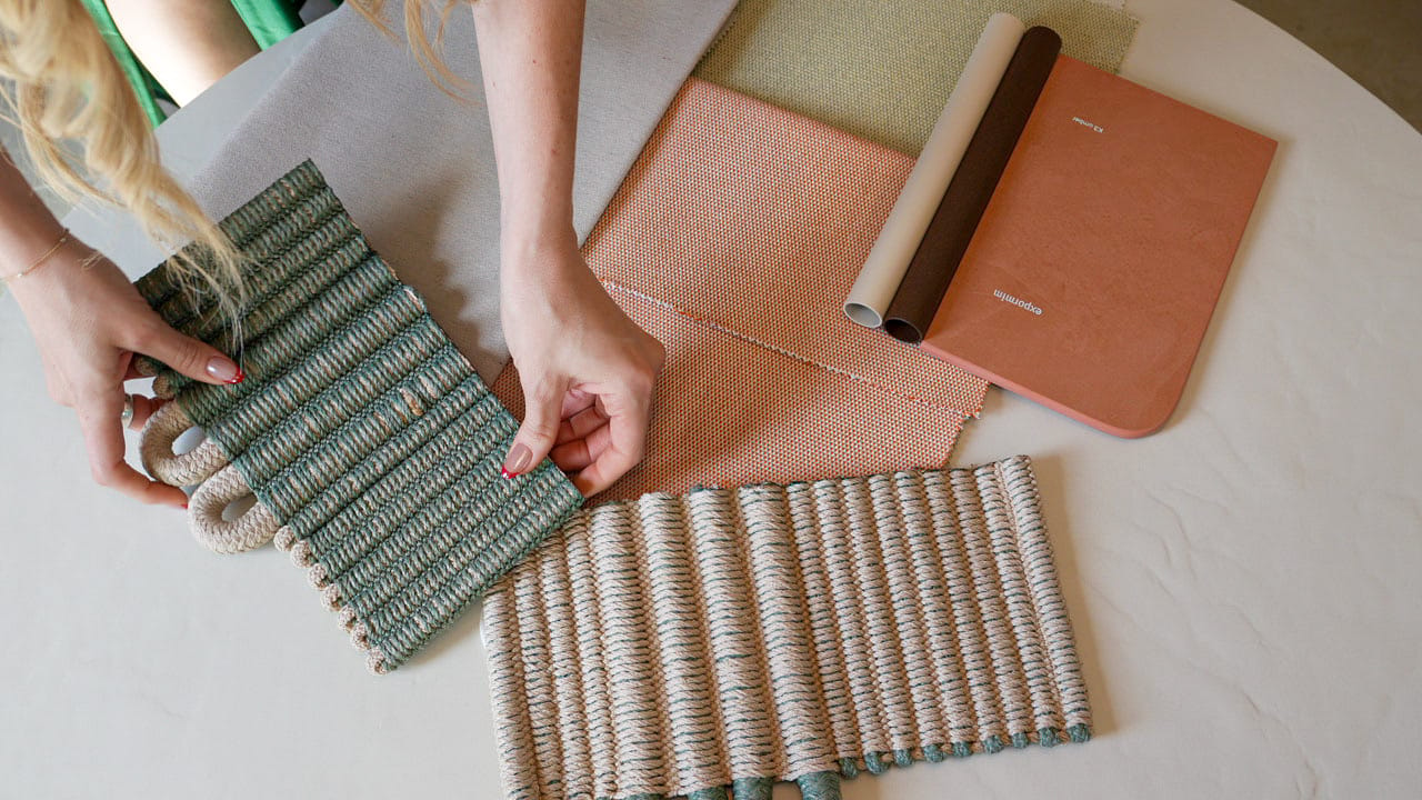
In today’s real estate market, design is no longer a finishing touch, it is a strategic decision.
Color choices influence how a property feels, how buyers perceive quality, and how confidently they make decisions. As we move into 2026, interior color trends are shifting away from short-lived statements and toward timeless elegance, visual calm, and intentional sophistication. These palettes are not about trends for trend’s sake, but about how spaces support lifestyle, emotion, and long-term value.
Below, we explore the key 2026 color trends and why they matter for homeowners, sellers, and investors preparing properties for the market.
Cloud Dancer: The New Sophisticated Neutral
Cloud Dancer is a soft, refined neutral that enhances light and creates immediate openness.
It provides a clean foundation without feeling cold or generic. Best used in: living rooms, primary bedrooms and open-concept layouts.
Real estate insight:
Neutral tones like Cloud Dancer allow buyers to mentally place themselves in the home, reducing hesitation and increasing emotional connection.
Warm Eucalyptus: A Subtle Connection to Nature
Warm Eucalyptus introduces a gentle green with warm undertones that conveys balance and well-being.
It feels modern, calming, and grounded. Ideal for: home offices; guest bedrooms; and quiet, restorative spaces.
Market relevance:
Nature-inspired interiors are increasingly associated with quality of life, a major driver for today’s buyers.
Universal Khaki: Stability and Conscious Elegance
Universal Khaki is a grounded, earthy neutral that brings warmth and structure to a space without overpowering it. Works well in: Social areas, dining spaces and transitional rooms.
Strategic value:
This color communicates permanence and stability, qualities that resonate with buyers seeking long-term ownership or secure investments.
Warm Mahogany: Depth and Natural Sophistication
Warm Mahogany adds richness and depth, creating spaces that feel curated and intentional.
When paired with proper lighting, it elevates without closing the space. Best used as: accent walls; dining or study areas; and intimate, refined spaces.
Design note:
Balance is key. Used selectively, it enhances luxury perception.
Hidden Gem: Quiet Luxury Through Color
Hidden Gem is a deep, understated tone that communicates sophistication without excess.
It adds character while maintaining restraint. Ideal for: private areas, boutique-style interiors and homes aiming for a curated feel.
Real estate perspective:
Subtle details often differentiate a property more effectively than bold statements.
Devine Damson: Controlled Drama and Character
Devine Damson delivers richness and presence while remaining elegant and controlled.
It creates memorable spaces when used intentionally. Best suited for: select social areas, feature spaces and homes with strong architectural identity.
Market impact:
Tasteful drama helps a property stand out without alienating buyers.
Silhouette: Modern Minimalism
Silhouette is a soft, modern gray that conveys clarity, balance, and sophistication.
It allows materials, textures, and natural light to take center stage. Perfect for: contemporary kitchens, open living spaces and minimalist interiors.
Why it works:
Warm, balanced grays remain a safe yet refined choice when applied thoughtfully.
Beyond Color: Design as a Strategic Asset
Color selection should never exist in isolation, especially when preparing a property for sale. In design-aware markets, strategic design: enhances first impressions, accelerates buyer decisions, supports stronger pricing and differentiates similar properties.
Design becomes part of the sales strategy, not just the presentation.
For Sellers Preparing to List: Why Color Strategy Matters in 2026
For sellers preparing to list, color is one of the highest-impact, lowest-cost adjustments that can significantly influence buyer perception. In 2026, buyers respond best to homes that feel: calm and intentional, move-in ready and timeless rather than trendy.
Strategic color choices help sellers: create emotional connection during showings; highlight space, light, and architectural features; reduce objections related to “updates”; and support smoother negotiations and stronger pricing.
The objective is not personalization, it is positioning. How do 2026 color trends help sellers prepare a home for sale?
In 2026, sellers should focus on warm neutrals, nature-inspired tones, and timeless color palettes. These choices improve buyer perception, enhance natural light, and help properties feel move-in ready, supporting stronger value and faster decision-making.
FAQ
Do interior colors really affect property value?
Yes. Color impacts perception, emotional response, and buyer confidence. Thoughtful palettes can shorten time on market and support stronger offers.
Should sellers repaint before listing in 2026?
In many cases, yes. Strategic repainting refreshes a property and improves first impressions when the right tones are chosen.
What colors help homes sell faster in 2026?
Soft neutrals, warm grays, earthy tones, and subtle accent colors photograph well and appeal to a broader buyer pool.
Can the wrong colors slow down a sale?
Absolutely. Overly bold or highly personalized colors can distract buyers and create unnecessary objections.
Is color strategy more important in higher-end properties?
Yes. Buyers in higher price points are more design-aware and expect cohesion, quality, and intentionality.
The color trends of 2026 are not about being bold, they are about being intentional.
When design aligns with market insight, it becomes a quiet but powerful driver of value.
We will continue sharing insights where design, lifestyle, and real estate strategy intersect, helping sellers and homeowners make informed, forward-thinking decisions.